
by Kevin Pointer Sr.
Effective Order to Transport Design: How KrushPoint Will Expertly Architect Layouts and Grids for Table Talk Restaurant’s Website & Beyond
Visuals, colors, and typography are only the beginning of effective branding — the kind that contributes to more cash flow in a local business’s coffers. Grid usage — the structural backbone of design—is an underrated technique that, when guided by the strategic standards of Krush Point’s leadership, works with precision. By utilizing these rigid architectural frameworks, KrushPoint bypasses the cluttered, unpredictable layouts that characterize the clickbait cheapness of “trendy” design, providing Tabletop with a foundation of lasting brand authority.
It begs the question: Is your digital presence — your website or newsletter — architected as a strategic, authentic asset or merely a structural afterthought?”
Enter KrushPoint. We don’t just build digital interfaces for temporary gratification; we architect legacies.
And, just like the spokes within a wheel, every design element — from grid structure to layout usage —counts to nudge and move Table Talk restaurant toward a better bottom line.
As we facilitate the digital evolution of Tabletop Diner, we aren’t just moving pixels — we acutely realize that we are helping to manage an Alexandria icon. For a heritage powerhouse with deep community roots, the goal isn’t radical reinvention; it is reinforcement. We use Grids and Composition not as a cosmetic mask, but as a silent partner in brand authority.
In a chaotic digital market, order isn’t just a design choice — it’s a promise of reliability and trust. When I, Kevin Pointer, CEO of KrushPoint, order “the 10-year usual” — from my beloved Table Talk diner — you know the ground chopped steak, medium rare with A1 sauce and strawberry jelly toast with two packs of butter — I trust that the meal will consistently meet my expectations.
The Genius of the Expected: Discipline Over Ornamentation
The journey of this digital architecture begins with Tabletop’s Website and Newsletter Wireframes. At KrushPoint, we recognize a truth that amateur designers often miss: the true genius of a a grid and layout lies in their predictability and their partnering alignment with the design goals at hand. By establishing a disciplined grid structure at the wireframe stage (See Figure 1), we ensure the digital experience feels as reliable as a seat at the counter with the Yates family. As Cardwell (2019) indicates, structural choices must align with the brand’s core identity. This transition from skeleton to skin is realized in the high-fidelity rendering (See Figure 2), where we deliberately avoid “slick” techniques that break the grid for the sake of a trend.
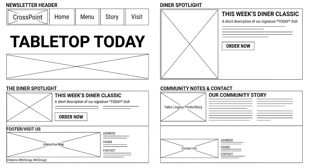
Figure 1
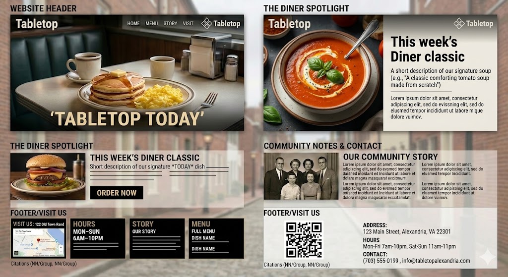
Figure 2
The Multi-Channel Blueprint
This structural discipline extends beyond the homepage and into the customer’s inbox. To maintain a consistent visual language blueprint and customer expectancy, Krush Point’s proposed newsletter architecture, for example, mirrors the website’s foundational logic and grid structure. Indeed, KrushPoint first established a predictable and older audience focused hierarchy through a clean, traditional newsletter layout (See Figure 3: Newsletter Wireframe) before applying the brand’s aesthetic layers (See Figure 4: Final Newsletter Brand Mockup). This ensures that every design touchpoint reinforces Table Top restaurant’s same sense of stability and heritage.
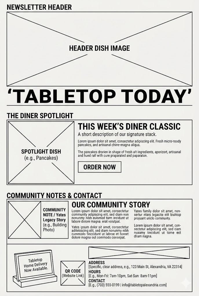
Figure 3
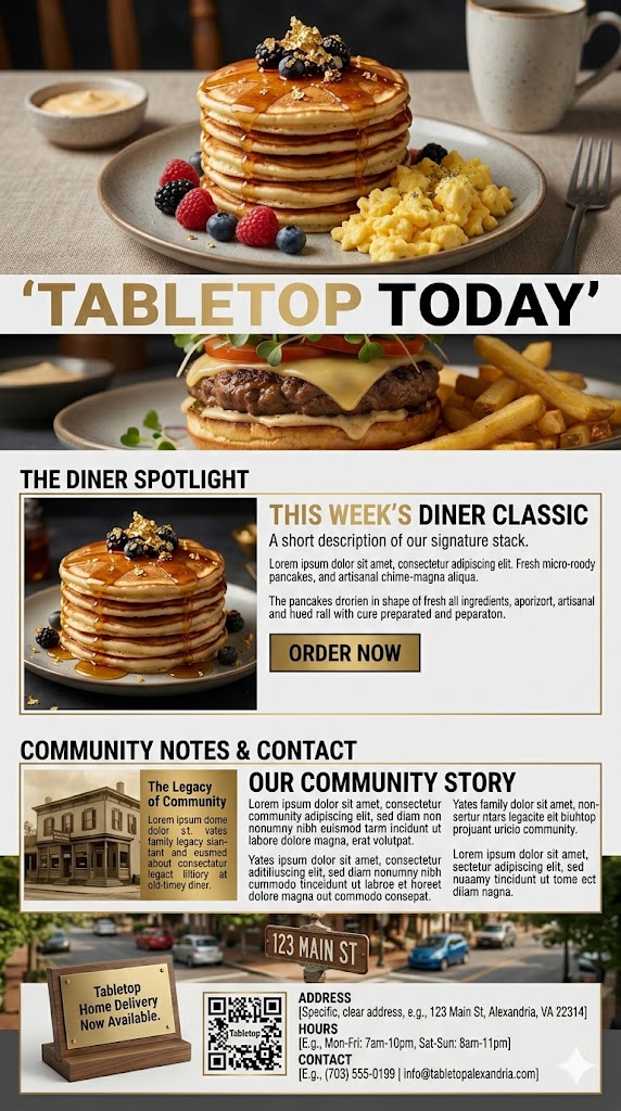
Figure 4
The Mobile Sovereign: A Strategic Nod to the Future
One test of an adaptive brand is how it merges its history with its future. As a Business Analyst with a focus on strategic graphic and media design, I see a modern hard truth that many overlook: the primary layout of engagement has shifted from the tabletop to the mobile screen.
For an Alexandria icon like Tabletop, a strategic nod to the future means treating the mobile screen, the cell phone as a high-stakes digital grid — and acknowledging and smartly using the cell phone for transactional powerhouse that it is. The same cell phones that a primarily younger restaurant demographic is restaurant searching for — right now! Such a digital grid requires the same architectural discipline as the updated physical menu choices that KrushPoint will collaboratively propose to ensure Table Talk stability and growth.”
The KrushPoint Advantage: The Power of Discernment
Effective strategic design is found in the power of discernment. Knowing when to hold ’em and when to fold ’em!. At KrushPoint, our discernment strength manifests refusing to blindly follow design trends. For an Alexandria institution like Tabletop Diner, straying into unpredictable or short-sighted layouts that ignore the brand’s heritage would be a big strategic failure. The synergy between predictability, collaborative design goals, and incremental change speak to an unwritten, silent bond of mutual reliance between the Yate’s Table Talk ownership and its patrons. A kind of visual language of trust.
Krush Point proposes to apply the architectural and layout logic that protects and maintains Table Talk’s rich heritage while positioning it for strategic growth. Krush Point well knows the difference between the grid and layout rules that need breaking and the ones that build dynasties.
References
- Cardwell, C. (2019). Graphic Design for Everyone: Understand the Building Blocks.
- Nielsen Norman Group. (2025). Responsive Web Design (RWD) and User Comprehension.