Kevin Pointer Sr.

Let’s get real for a second: color isn’t just some fancy decoration slapped on your logo or website. It’s a full-on psychological ninja that sneaks into your brain, stirs up feelings, and screams a message about who you are — before you even say a word. At Krushpoint, we know this. Our brand colors aren’t random; they’re strategic muscle fibers working together to make the brand run hard and fast in a crowded marketplace.
“You might be thinking, “Wait, Kevin, isn’t color just about looking nice and what I personally like?” Nope. Not really. Business-wise, profits reward influence. Reward connection. Reward trust. And if you are not constantly seeking to optimize those intangibles then you’re not just clumsy — you’re invisible.”
Why Color Psychology Matters for Your Brand
Colors trigger emotions, affect moods, and guide decisions. Psychologist Andrew Elliot explains that color influences human emotions in profound ways (Annual Review of Psychology, 2014). Think about it: red grabs your attention and pumps up adrenaline; blue calms nerves and builds trust; yellow sparks energy and optimism. These aren’t just feelings — they’re your brand’s silent salespeople, hustling 24/7
Krushpoint’s color palette is no accident. Marketing experts Labrecque and Milne note that color differentiation shapes consumer perception and brand recognition (Marketing Letters, 2013). Each color is a cog in the machine, playing off one another to create synergy — like muscles firing in perfect harmony when you’re sprinting toward success.
Meet the Muscles: Krushpoint’s Brand Colors in Action
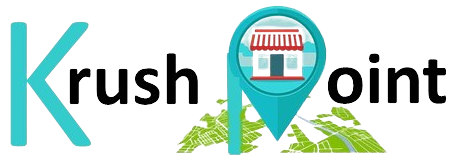
Our signature colors are bold yet approachable. They’re modern but warm. When you look at the Krushpoint logo, you’re not just seeing colors — you’re witnessing a conversation between clarity and creativity.
- Primary Blue: The backbone of trust and professionalism. It’s the steady heartbeat that reassures clients we know our stuff.
- Accent Orange: The spark of energy and innovation. It’s the kick in the pants that says, “We’re here to shake things up.”
- Neutral Grays: The grounding tones that balance boldness with calm, making everything readable and approachable.
Graphic design expert Cath Caldwell emphasizes how color and typography work hand in hand to build brand identity (Graphic Design for Everyone, 2017). This trio doesn’t just sit there looking pretty. They work synergistically, like a well-oiled machine, so your eye moves naturally, your brain processes the message clearly, and your gut says, “Yeah, these folks get it.”
Typography and Color: The Dynamic Duo
“Color doesn’t act alone. It’s got a partner
in crime: typography.”
The fonts we’ve chosen for Krushpoint — clean, modern sans-serifs with a touch of friendly serif accents — team up with our colors to amplify our personality. Together, they build hierarchy, guide attention, and keep the brand voice unmistakably confident yet approachable.
Imagine a marathon runner. The muscles (colors) provide the power, but the skeleton (typography) gives structure and direction. Without one, the other can’t perform. Together, they push Krushpoint forward.
Real-World Test: The Grand Opening and Milton Glaser Posters
Soon, we’ll put this color theory to the test with two big projects – the Krushpoint Grand Opening event poster and a creative homage to Milton Glaser’s iconic style. Both will experiment with different color palettes — including our brand colors — to see how color shifts mood, message, and impact. Management researcher Sachin Singh highlights how color impacts marketing effectiveness (Management Decision, 2006). It’s the ultimate proving ground for our brand’s visual voice.
Final Thought: Color Is Your Brand’s Secret Weapon
Ignore color at your peril. Nail it, and you’re not just in the game—you’re leading it. Krushpoint’s colors aren’t just paint on a canvas; they’re the psychological fuel driving recognition, trust, and ultimately, business growth.
So next time you glance at our logo or a poster, remember: you’re witnessing a symphony of hues working together to move the brand — and you — forward.